Developer Portal Navigation Redesign (Backstage Sidebar)
Reducing friction in high-frequency developer workflows
Quick summary
Led a navigation redesign for a Backstage-based developer portal focused on reducing friction in high-frequency workflows. Replaced nested flyouts with inline navigation and surfaced core controls (theme + collapse) to reduce time-to-task and improve discoverability for developers.
The challenge
Developers struggled with hidden controls and multi-step navigation. Key actions like theme toggle and sidebar collapse were buried under Settings, and catalog navigation relied on right-side flyouts that added visual layers, increased cognitive load, and slowed routine tasks. Support questions increased as critical functionality became harder to find.
The solution
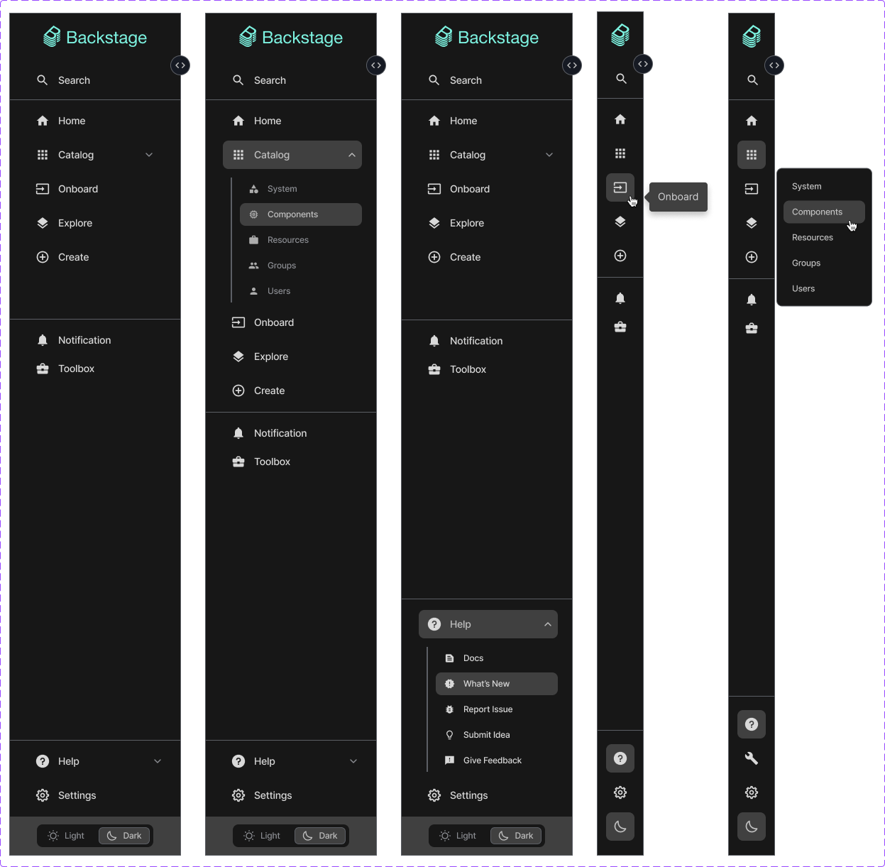
Re-architected the sidebar information model: converted flyouts into inline accordion navigation, moved high-frequency controls into persistent sidebar locations, and applied accessibility-first interaction design (keyboard navigation, ARIA labeling, clear affordances). Partnered with engineering to validate interaction states and implement animations that support comprehension without adding complexity.
Why this matters for AI developer tooling
AI platforms succeed when developers can discover the right capability quickly, understand it with minimal friction, and take confident next steps. This work focuses on the same adoption levers: information architecture, discoverability, reduced cognitive load, and clear paths to action—principles that also apply directly to AI API docs, SDK guides, and workshop materials.
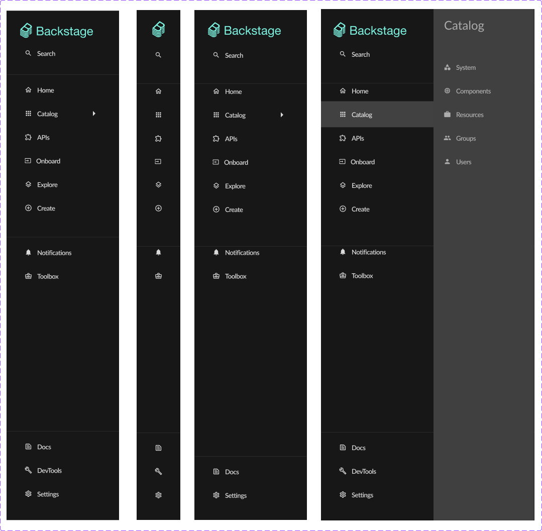
Current UX issues
Inefficient navigation flow
The catalog menu opening to the right creates an additional layer of navigation that increases cognitive load and requires more precise mouse movements.
Excessive clicks
Placing Light/Dark mode toggle and Sidebar expansion controls under Settings requires three clicks, violating usability principles.
Hidden functionality
Critical UI controls buried in submenus, making them less discoverable to new users.
Outdated patterns
Modern applications provide direct access to theme toggles and sidebar controls within the main interface.
Poor space utilization
Sidebar doesn't efficiently use vertical space, which could be better leveraged with expandable sections.
User research & goals
User intent
“As a Backstage user, I want quick access to catalog menu items and UI controls so I can navigate the platform more efficiently and customize my viewing experience with fewer clicks.”
Key user needs
Key design changes
Inline expandable catalog
Each catalog label now functions as an accordion header that reveals submenu items directly beneath it in the sidebar. A chevron icon provides clear affordance, rotating to indicate expansion state.
Accessible theme toggle
The Light/Dark mode toggle now resides at the bottom of the sidebar with appropriate icon (sun/moon) indicating current state and action.
Sidebar collapse control
The expansion control moved to a prominent position near the top of the sidebar with directional chevron icon. Collapsed state shows only icons with tooltips.
Impact & success metrics
Key results
Reduced steps to access theme toggle (3 → 1)
Reduced steps to collapse/expand sidebar (3 → 1)
Improved navigation efficiency by removing flyout layering (observed in workflow reviews)
Reduced support questions related to hidden controls (observed in feedback loops)
Improved satisfaction in internal feedback and usability reviews (observed)
Increased engagement with core navigation and controls (observed)
Evidence & validation sources
- Internal usability testing sessions with platform engineers
- Product owner and stakeholder review notes
- Support feedback trends reviewed during sprint retros
- Navigation workflow walk-throughs during design critiques
Design documentation
Before and after comparison showing the transformation from flyout-based navigation to inline expandable sections