Template Catalog Redesign (Developer Self-Service)
Improving discovery, selection confidence, and adoption
Quick summary
Redesigned a developer template catalog to improve self-service discovery and selection. Increased the number of templates visible at a glance, introduced search + filtering patterns that scale, and made metadata actionable (clickable tags) to reduce time-to-find and improve user confidence.
The challenge
As the template ecosystem grew, developers struggled to find relevant templates quickly. The default catalog layout showed too few options above the fold, encouraged scrolling over scanning, and treated key metadata (tags) as static labels. The result: slower discovery, reduced confidence, and more support requests for "which template should I use?"
The solution
Designed a compact, responsive grid layout and a filtering system that supports real discovery: Quick Filters, Categories, Teams, and Tags; an Active Filters summary with clear/remove behaviors; clickable tag chips that apply filters directly; and improved template cards with clearer hierarchy, "favorite" affordances, and documentation links. The interaction model prioritizes fast scanning, low cognitive load, and predictable refinement.
Why this matters for AI developer tooling
AI platforms succeed when developers can discover the right capability quickly, understand it with minimal friction, and take confident next steps. This work focuses on the same adoption levers: information architecture, discoverability, reduced cognitive load, and clear paths to action—principles that also apply directly to AI API docs, SDK guides, and workshop materials.
Current UX issues
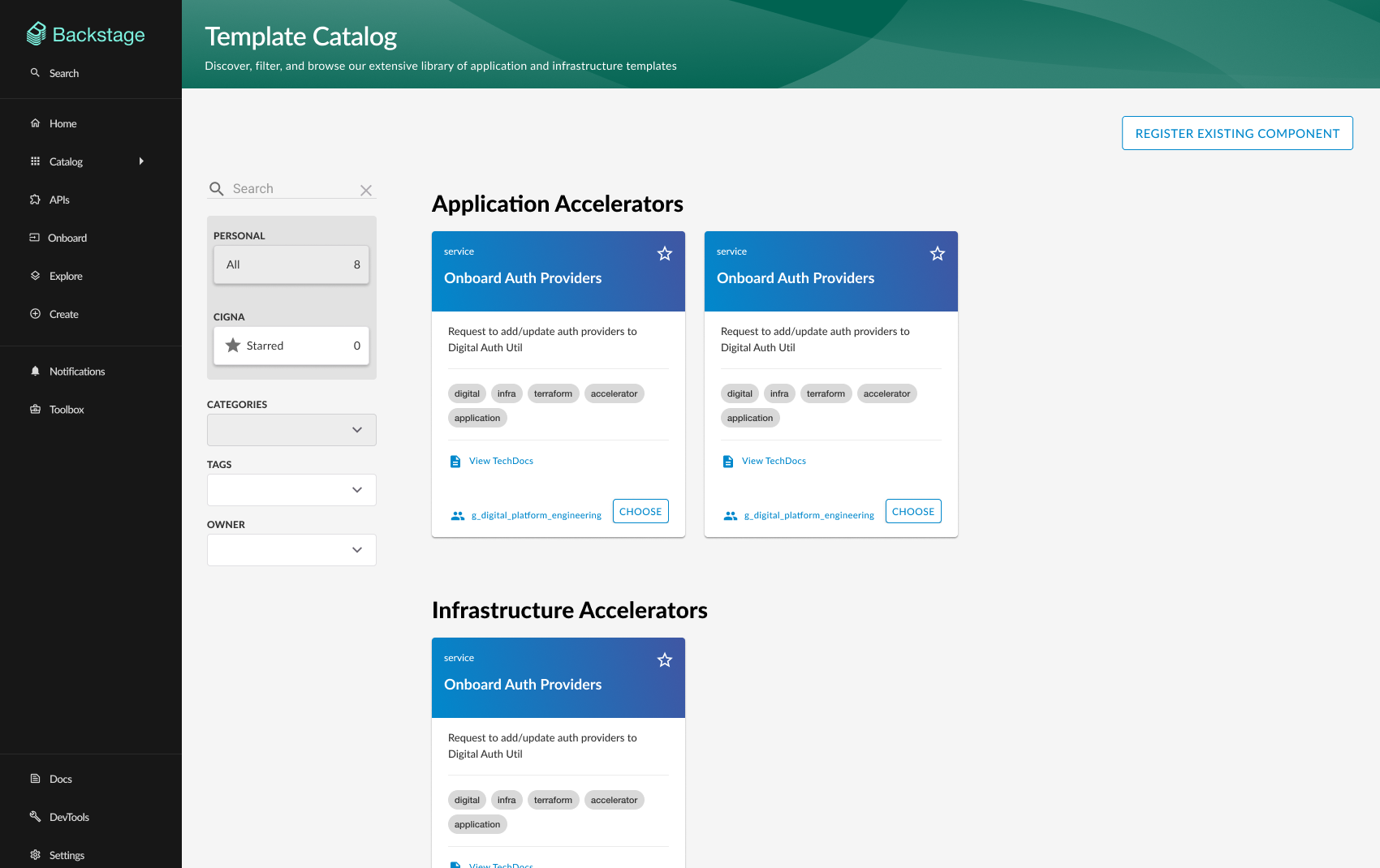
Limited visibility
The interface could not display many template cards above the fold, requiring users to scroll extensively to view and compare options.
Excessive real estate usage
Large tagline and heading occupied significant space at the top, reducing the area available for displaying templates.
Non-interactive elements
Tag chips on template cards were non-clickable, limiting functionality and reducing opportunities for dynamic filtering.
Poor discovery tools
Limited search capabilities and lack of sophisticated filtering made it difficult to find relevant templates quickly.
Navigation inefficiencies
Users struggled to explore different template categories and understand relationships between templates and their domains.
User research & goals
User intent
“As a template user, I want a simple and intuitive tool for finding and discovering templates so I can build infrastructure and run processes efficiently.”
Key user benefits
Key design changes
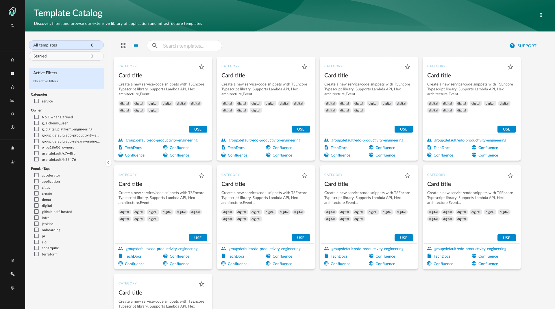
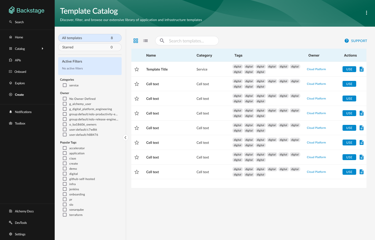
Optimized layout architecture
Removed or minimized oversized taglines and headers, implemented a compact responsive grid system that displays 200% more templates above the fold while maintaining visual clarity.
Interactive tag chips
Transformed static tag chips into clickable elements that directly add filters to the sidebar, enabling dynamic, real-time filtering capabilities based on user interaction.
Intelligent filtering sidebar
Introduced a comprehensive sidebar with Quick Filters, Categories, Teams, and Tags. Added an Active Filters card displaying all selections with individual remove options and a clear-all function. Implemented badge counters showing matching template counts.
Enhanced search integration
Enhanced search bar to work in combination with active filters, enabling users to search across template names, descriptions, and tags while applying additional filter criteria.
Improved template cards
Redesigned cards to include category labels, star buttons for favoriting, interactive tag chips, usage count statistics, and direct documentation links.
Impact & success metrics
Key results
Increased above-the-fold template visibility through a compact grid layout (observed)
Reduced time-to-find templates using search + filters (observed)
Improved confidence during template selection (observed in feedback and reviews)
Reduced friction by adding interactive tags and active filter controls (observed)
Increased template usage following improved discovery patterns (observed)
Reduced support questions about template selection (observed)
Evidence & validation sources
- Usability testing sessions with template consumers
- Internal feedback from platform enablement teams
- Design review notes from Alchemy stakeholders
- Template discovery walkthrough observations
Design showcase
Before and after comparison showing the transformation from limited visibility to an optimized discovery interface